From January 2013 through May 2014, I worked at SN Works as part of a team of developers, designers, and project managers to build, redesign, and maintain websites for college newspapers across the United States.


I used HTML5, CSS (and LESS as a pre-processor), JavaScript, jQuery, PHP to write and edit code inside the TWIG template system. We used Git for version control, and programs such as JIRA and Basecamp to control work-flow. We used our own in-house content management system, Gryphon.
As a Front End Web Developer, I viewed myself as a back end storyteller—helping students across the country tell the stories that were important to their communities.
The American University Series
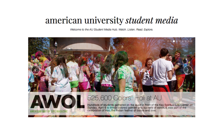
Perhaps the largest project I worked on at SN Works was the American University series of websites. American University contracted SN Works to develop more than half a dozen websites for their various types of student media. The website pictured above, American University Student Media, was a hub where recent stories from each website were highlighted in a carousel.
Another developer and myself worked on the initial development of this website, including the carousel. The largest challenge we faced was figuring out how to place the logo of each site on the appropriate image. The solution I came up with was to use a file-include in the appropriate place within the for-loop for the carousel. This file contained an if-statement which matched the tag of the image in the carousel with an image in the if-statement.
An example of the if-statement (written in TWIG syntax):
AmLit


My two largest contributions to this site were the archives page, fixing several glitches in the front-page carousel, and reformatting the blogs. The blogs went through several stages of restyling, which was made especially difficult as the client wished to embed images from the blog posts directly into the body copy within the CMS instead of attaching them, which not only made styling this portion of the site more difficult, but also left the posts possibly vulnerable to getting messed up during data-migration.
My largest contribution to the blogs section of the site was the date and time formatting. The client wanted a similar format for the date and time as wvau.org had. This was a challenge for me as I had very little experience dealing with how date and time worked, not only in TWIG, but in PHP itself. The biggest problem was including “a.m.” and “p.m.” with the periods, as I’d never seen an example of that in any of the other sites I’d worked on at SN Works. After asking coworkers who had more experience in the area for information and direction, a lot of googling and a look-through of TWIG’s documentation, I learned how to make this happen.
The main glitch with the front-page carousel was that container changed to the size of each image. While there were a few bumps along the way, the problem was eventually resolved by fixing the height of the container and hiding the overflow from each image.
The archives section involved my first foray into working with Issuu, and once I’d gotten the hang of it, all that was left was taking screen caps of the already published issue covers and uploading them into the CMS with proper tags.
The Daily Wildcat


My largest contribution to this redesign project were the multimedia components, specifically the multimedia tiles on the front page and the carousel on the multimedia page.
The tiles were difficult to format as there were three types of multimedia I had to deal with: video, images, and galleries. Each had a different reaction when hovered over and each image wanted to behave differently on appearance. We also had the problem of what to do if the caption of an image was so large that it obscured the image. I used media queries to ensure the tiles were responsive, set the overflow to hidden so the images would fill the width and height of their container without becoming squished or pixellated.
 Charlotte Hutchens
Leave a comment